What is wrong is current online packaging?
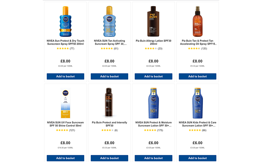
The current online packaging is simply a small image of the physical packaging. This causes the unique features of each product to drown in a sea of other products. This can be frustrating to the customer because it takes time to click on each product to find more detailed information. And crucially, the brain does not respond to these images in the same way as it does to physical products.
As online shopping is becomingly increasingly popular for all sorts of products, the current form of online packaging may have run its course. So what’s the alternative? Read on to find out.
The study
Imagine you are going on holiday to a sunny destination, and you want to buy some sunscreen online. The image above perfectly depicts the problem. None of these products are particularly inviting and unless you click on each one individually, you don’t know whether the products meet your personal requirements for sunscreen.
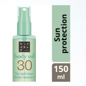
We’ve tested an alternative design: a brain-friendly packaging. The research revealed that the current online packaging is not as effective as it could be, but new brain-friendly online packaging could be the answer. This packaging highlights the most important information of the product in a clear format. For instance, the SPF protection, the function of the product, and the spray top are clearly seen without the need to click on the product first.
Testing packaging with fMRI
We’ve conducted a study with four kinds of online packaging to determine which one best represented the real product. These were:
- An image of the life-size packaging
- The typical online packaging used: a small image of the real thing
- A digitally adapted packaging that highlights the important features of the product
- The same as 3, but with a background
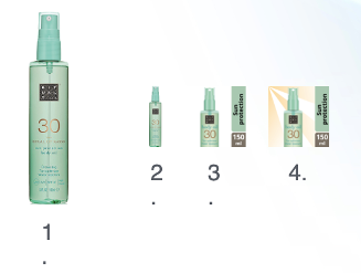 Those taking part in the study were shown these four types of packaging in an MRI scanner. Six different brands of sunscreen were tested.
We’ve used fMRI as it captures brain activity from all over the brain. It shows both the conscious and unconscious response to a product. Simply asking consumers what they think about the packaging will not produce this kind of information. This is because consumers are surprisingly poor at predicting the choices they’ll make in the future.
By using fMRI, we can compare the brain activity when looking at the online packaging options to the activity when looking at the image of the life-size physical product. In this way, we can see whether the activation in the brain is similar between packaging types. This technique is useful for predicting consumers’ actions when shopping.
Current online packaging does not activate the grabbing response
When you reach for something in the shops, the so-called “grabbing-response” is activated in the brain. This response is a combination of visual activity and movement activity in the brain whereby you see the product and reach for it. This response is crucial to buying a product.
Of course, this response was activated for the image of the physical product. However, for the current online packaging type, this response was very weak. This means that we don’t want to grab the product in its current online format, which isn’t ideal for selling products. Our brain doesn’t equate the current online product to the physical product. This means that we are less likely to buy it.
So how did the brain-friendly packaging designs fare? The grabbing response was present for these designs, in a similar way as to the physical packaging. Being able to see important detailed product information quickly activated the grabbing response.
It’s important to remember that many product features cannot be recreated online such as, the smell and the feel. Therefore, the online experience needs to be matched to the in-person experience as best it can be. Current online packaging is not optimally matching in-person packaging. An update is needed.
With the increasing popularity of online shopping, brands should aim to increase the “grabbing response” for their products online. By tailoring the packaging to a brain-friendly online format, brands can kill two birds with one stone and increase likelihood of purchase and improve customer experience.
